

Showing posts with label taking great photos. Show all posts
Showing posts with label taking great photos. Show all posts
Monday, 6 July 2015
Five Ways to Breathe New Life Into Your Craft Photos
If you're sick of the sight of your craft photos, don't fret: there are ways to reinvigorate them. Today we're going to talk about five things you can do that are simple and achievable at home without expensive equipment. Read more at Tuts+! (See my other tutorials on Tuts+ by clicking here.)

Photo: Heidi Adnum. Beaded necklace by Ayala Bar. Thank you to Erin, my friend, for modelling.


Monday, 13 April 2015

Monday, 16 March 2015
Five Steps to Taking Great Photos of Your Craft Using Window Light
Make the most of the windows in your home or office by using them to take great photos. Learn how to set up the scene, choose the best time of day to shoot, and control the light. Window light also teaches us a lot about shadows and how to use them to enhance the details, depth and features of our craft. Read more at Tuts+! (See my other tutorials on Tuts+ by clicking here.)

Photo: Heidi Adnum. The pink blanket shown in the images was hand-knitted by my Mum using vintage yarn.
Thursday, 6 March 2014
Ten Great Backgrounds for Beautiful Craft Photography
Taking great photos of your craft for selling and marketing purposes can sometimes feel like a challenge. The good news is that it's easy to improve and make the process more enjoyable when you take it one step at a time. A good place to start is to choose a background that suits your craft. Read more at Tuts+!
 Photo: Heidi Adnum, Gift Boxes: BLANK Goods
Friday, 19 July 2013
Brisbane Photography Workshop
You're invited to join me, Sandrine Marsh, the BrisStyle Etsy Team and Etsy Australia at the Brisbane Square Library on Sunday, 4 August, from 10am for a photography workshop. The day is dedicated to the basics of product photography, including gaining a better understanding of your camera and light. Sandrine and I will offer friendly coaching on making better use of your camera and its settings, using light, and simple yet effective product styling. Our goal is to help you come away from the workshop with more confidence and more tools and tips for enhancing the look of your Etsy shop. As a special treat the event is totally free if you have an Etsy shop. Book now. Hope to see you there!

 Photo: Heidi Adnum. Styling: Lara Hutton
PS I'm now on Twitter. Let's connect!


Friday, 31 May 2013
Little Dog Vintage Photo Setup
Little Dog Vintage is a shop I've always admired. The carefully selected collection of vintage pieces are always interesting to browse and the photos are great. Claire Ferrante curates Little Dog Vintage and is photographer-in-chief. When I was researching and writing my book I had the privilege of meeting and featuring the photography of many talented crafters and artists whose pieces are handmade. If I was able to extend the features to photos of vintage pieces, I definitely would have invited Claire to participate. The crisp and simple photos show off each piece beautifully. Claire recently shared her new mobile DIY photo setup, including instructions, on her blog. I think it's a great idea and would make life easier for many crafters who want to take great photos. It could be made smaller if space is an issue or if products are small, and the background and base could be changed with paint or fabric when needed. See more of the process here. Follow Claire on Twitter.


Photos: Claire Ferrante
Wednesday, 3 April 2013
Basic Product Styling & Photography
This is one of those better-late-than-never posts. It occurred to me recently that I never posted the example photos from the presentation that stylist Lara Hutton and I shared last year at Etsy Success Sydney. The aim of these photos was to demonstrate how you can take a great product photo in a simple and straightforward way. We used an everyday home-like setting, some easy-to-find props, soft natural light and basic camera settings (adjusted according to the changing levels of light).
For our product we selected beautiful ceramics from Lara's own range of LH Objects. Lara also brought along her kit of trusty props and backgrounds. All images were shot in my hotel room on a table pushed up against the window. I was squashed in the gap between the table and the wall. The weather was rainy and overcast, which provided a perfectly softened light through the window. I shot three photos of each product: 1. Appealing, 2. Less Appealing, and 3. Setup. I used the same straight-on angle for the 'appealing' and 'less appealing' photos to keep one thing consistent and show the changes to the background and styling. We had little time to shoot and limited space in our presentation, so we shot only one 'appealing' photo per product. (Normally, of course, you would shoot several, including close-up detail shots.)
Today I'm going to share with you all of the photos and some of the thoughts that Lara and I had about them on the day. I hope that this is helpful to crafters out there who didn't get to come along to our workshop at the event, but who want to get started with, or learn more about, the basics product styling and photography.
We started with a delicate little Mushroom. Lara styled the shot with a slim rectangular cutting board and a white semi-transparent paper garland. The background is a piece of card in a soft mint green colour and the base is textured white wallpaper. The shot works well because it's simple and the product is the focus, and the styling elements compliment the look and feel of the product. In addition, the soft lighting creates soft shadows and a gentle feel to the image overall. Looking back, I probably should have used a smaller aperture to gain greater depth of field to show the little dots on the stem in clearer focus. (To compensate for the smaller aperture - a less wide open lens - I could have increased the ISO or decreased the shutter speed.) Camera settings: shutter 1/100 sec, aperture f/4.0, and ISO 200.
 The 'less appealing' photo is really all about the angle from which I shot the Mushroom and the framing. I wanted to show how this angle doesn't work for this product As the viewer, we're not really sure what the product is; this angle makes the Mushroom look more like a bowl. Detail is lost, too; we can no longer see the lovely little dots detail on the underside and the stem. Aside from this, the positioning of the Mushroom, or its framing, is too high and this draws our attention to the front point of the cutting board. Then, our attention diverts to the seam of the background and base, and then the dark triangle of the table where the white wallpaper base runs out. This angle with a tighter crop (to avoid those distractions) would no doubt work nicely for a detail shot of a different product, but here, it doesn't work. Camera settings: shutter 1/100 sec, aperture f/4.0, and ISO 200.
 Here's the setup. Notice the window, table, roll of wallpaper, card background, and one of Lara's other props - a wooden crate - being used to hold it all together.
 We then moved on to Banded Bowls. Lara introduced the wooden crates (cheaply sourced from eBay) that she had painted white. One crate became the background and the other as a prop to add height, texture and interest, along with a vase and twig set back in the frame. Here, Lara introduced her 'style in threes' tip. Camera settings: shutter 1/40 sec, aperture f/5.6, and ISO 320.
 For the less appealing shot, I turned the camera setting to automatic (from manual) with on-camera flash. You can see that with the effect of the undiffused on-camera flash the image is too dark with harsh shadows and the ceramics don't look as natural or as beautiful as they really are. The twig is blurry and there's also a shadow at the bottom of the image where the flash has caught the lens hood. (If you don't use a lens hood, this can also happen if your finger moves in front of the flash.) Look closely at the far rim of the bowl on the left and you can see two small reflections caused by the flash. If the outside of the bowl was also glazed and shiny, this effect would be more obvious. The same applies to any other shiny product and undiffused on-camera flash. This reflection/glare is a common problem with the combination of the automatic setting and harsh on-camera flash. The rear of the scene is dark because the harsh undiffused on-camera flash blasts the objects in its direct path and then drops off behind them. Camera settings: shutter 1/60 sec, aperture f/4.0, and ISO 400 plus flash.
 The setup for this shot is very similar to the Mushroom with the wallpaper base. Notice that it's the underside of each crate that Lara is using here.
 Lastly, we used these adorable Feather vases. We changed the background to a sheet of thin plywood. Lara stuck three white paper circles to the plywood. This time, a round cutting board acted as another base to raise up the two smaller vases. Another thing to note about the props in general is that they are all in the style and tone of Lara's ceramics, and, therefore, nothing looks out of place. Certain props, perhaps those brightly coloured, patterned, or high-shine, would have been out of place with these muted and sophisticated ceramics. Notice again the grouping of threes: the vases and the circles. Camera settings: shutter 1/40 sec, aperture f/5.6, and ISO 200.
 The less appealing shot here isn't as bad as the other two and the reasons for it mightn't be obvious at first. There are too many props - a fourth circle, some shells, a twig and a paper decoration - to demonstrate how even coordinating and lovely props can still be too much. They're too much because they distract the viewer from the product. I've also cropped the shot more widely, which makes the vases seem smaller or further away and less the focus of the shot. Camera settings: shutter 1/40 sec, aperture f/5.6, and ISO 200.
 The setup is, once again, almost the same as before, however, there is a helpful message here: One basic setup template, which can be moved around your home/studio depending on the availability of light, can generate many different results. In these three examples we kept it very simple and stuck with the same aesthetic to be in line with the LH Objects brand, but you could use a whole host of different backgrounds and bases to find what most suits your product, or just to play around with them. If you work with small products, you can create a smaller setup template, and vice versa for large products by using big sheets of plywood, MDF, fabric or paper.

For our product we selected beautiful ceramics from Lara's own range of LH Objects. Lara also brought along her kit of trusty props and backgrounds. All images were shot in my hotel room on a table pushed up against the window. I was squashed in the gap between the table and the wall. The weather was rainy and overcast, which provided a perfectly softened light through the window. I shot three photos of each product: 1. Appealing, 2. Less Appealing, and 3. Setup. I used the same straight-on angle for the 'appealing' and 'less appealing' photos to keep one thing consistent and show the changes to the background and styling. We had little time to shoot and limited space in our presentation, so we shot only one 'appealing' photo per product. (Normally, of course, you would shoot several, including close-up detail shots.)
Today I'm going to share with you all of the photos and some of the thoughts that Lara and I had about them on the day. I hope that this is helpful to crafters out there who didn't get to come along to our workshop at the event, but who want to get started with, or learn more about, the basics product styling and photography.
We started with a delicate little Mushroom. Lara styled the shot with a slim rectangular cutting board and a white semi-transparent paper garland. The background is a piece of card in a soft mint green colour and the base is textured white wallpaper. The shot works well because it's simple and the product is the focus, and the styling elements compliment the look and feel of the product. In addition, the soft lighting creates soft shadows and a gentle feel to the image overall. Looking back, I probably should have used a smaller aperture to gain greater depth of field to show the little dots on the stem in clearer focus. (To compensate for the smaller aperture - a less wide open lens - I could have increased the ISO or decreased the shutter speed.) Camera settings: shutter 1/100 sec, aperture f/4.0, and ISO 200.


Take a look at the Etsy Blog for the video of the event plus more tips.
Wednesday, 27 March 2013
Book Feature: Expression of Interest
Part of what I do is picture research, which involves finding great photos to feature in books. Whilst I can't normally share what topic I'm currently working on, I can now offer you a way to express your interest in being involved. If you are a crafter, blogger, artist, photographer or designer with great photos of your work and you'd like to have them featured in a book, let me know by completing this form. I'm going to check the list regularly and will be in touch via email with anyone whose images are a great match to the book I'm working on with an invitation to participate. You can also follow me on Twitter for updates.


Monday, 22 October 2012
taking great photos: french edition
The Crafter's Guide to Taking Great Photos has been translated into French! 'Photographiez vos Créations' is now available from publisher Eyrolles, and also at Amazon.fr and fnac. Read a few tips from the book on the Blog Français d'Etsy. Oui oui.

Tuesday, 11 September 2012
taking great photos: japanese edition
I'm very excited to announce that the Japanese edition of my book is now available! Find out more about 'Craft Photo Lesson' here and pre-order at Amazon Japan. To celebrate the launch, BNN, the Japanese publisher, is generously offering four lucky readers a chance to win their very own copy. For your chance to win, tell me why you need a copy of the Japanese edition. Send your entry as a comment on this post or in an email to me. Perhaps you or a friend is just about to launch your own product line in Japan and taking great photos is on the to-do list. Maybe you have a well-established online shop that you feel isn't reaching its full potential and beautiful new photos are exactly what's in order. You have until Friday 28 September to enter. BNN will send each winning copy directly from Japan to its new owner anywhere in the world. Good luck!
 Main image: Ohoy Wallpaper by Fine Little Day
Friday, 24 August 2012
2012 craft awards nomination for best new book
I'm absolutely delighted and feel very honoured to receive a nomination for Best New Book in the 2012 Craft Awards. Huge thanks to everyone that took the time to nominate The Crafter's Guide to Taking Great Photos; I'm so pleased that you're loving it. It's great simply to be nominated but if you can, please vote for me and spread the word! Visit the Crafts Beautiful Magazine website to cast your vote. Thanks for all your support, I appreciate it.


Wednesday, 6 June 2012
photography workshops
I had a great time at Etsy Success Sydney. It was lovely to meet so many great people and present with Lara. Something I'm reminded of every time I have the opportunity to take part in special events such as Etsy Success Sydney is how much I enjoy teaching, sharing and helping to develop skills when it comes to photography. For some time now one of my goals has been to start up a series of local photography workshops. I'm not yet quite sure what format they're going to take, or even where they're going to be held, but I know they'll be relaxed, down-to-earth, friendly, and open to everyone. To help me develop a programme and structure for my photography workshops that best meets your needs, I'd like to ask for your help. I've put together a short ten-question survey and would love to hear your thoughts on things like choosing the best days, times, duration, regularity, and, of course, content. If you might be interested in taking part in one of my to-be-determined photography workshops, I'd be grateful if you could complete the survey, found online here. It shouldn't take more than a few minutes to complete. Your results can remain anonymous (just don't enter your name and email address at the end) or you can choose to provide your details to be contacted about the workshops when more information is available. Thank you, in advance.


Friday, 11 May 2012
etsy success sydney
Are you going to Etsy Success Sydney? I am! Join us at the event on Saturday, 2 June, at the Museum of Contemporary Art from 9am to 10pm. Stylist Lara Hutton and I are speaking on The Basics of Product Styling and Photography. Tickets cost $100 and include access to all sessions, day-long catering and a delegate pack. Etsy Success Sydney is presented as part of the Vivid Ideas program at Vivid Sydney 2012 (25 May — 11 June), a festival of light, music and ideas, and a major celebration of our creative industries. Oh, and guess what? EtsyAU has kindly offered me one double-pass for a lucky reader (valued at $200). To win the tickets, by Friday, 25 May, tell me in a comment (below) or email why you need to attend the event. Good luck!


Monday, 19 March 2012
giveaway winner: gaelle lalonde
Hooray! One copy of Taking Great Photos is going out to Gaelle from Germany. Gaelle, originally from Canada, is a crafter and illustration student. She has crafted with women with special needs, earned a Bachelor of Fine Arts and is currently working on her Masters in illustration. Thank you to everyone who took the time to enter.
 Illustrations: Gaelle Lalonde

Friday, 9 March 2012
taking great photos giveaway: from me!
I'm so pleased to offer one copy of my book to giveaway. For your chance to win, tell me why you need a copy of the book and how will taking great photos help you. Post your entry in the comments field below or send it to me via email. (If you enter via commenting below, be sure to include an email address so that I can contact you if you win.) You're also welcome to attach or link through to one or two of your photos, if you like. Entries are open from now until Friday, 16 March. I'll announce the winner on Monday, 19 March. Murdoch Books is going to send the lucky winner one copy of The Crafter's Guide to Taking Great Photos (AU/NZ version/cover) to anywhere in the world. Good luck!


Tuesday, 21 February 2012
taking great photos giveaway: from heather
Are you feeling lucky and living in South Africa? If you are, Heather Moore from Skinny laMinx is the girl for you. Heather's running a giveaway on her blog for one copy of The Crafter's Guide to Taking Great Photos. You have until 29 February to enter. Good luck!
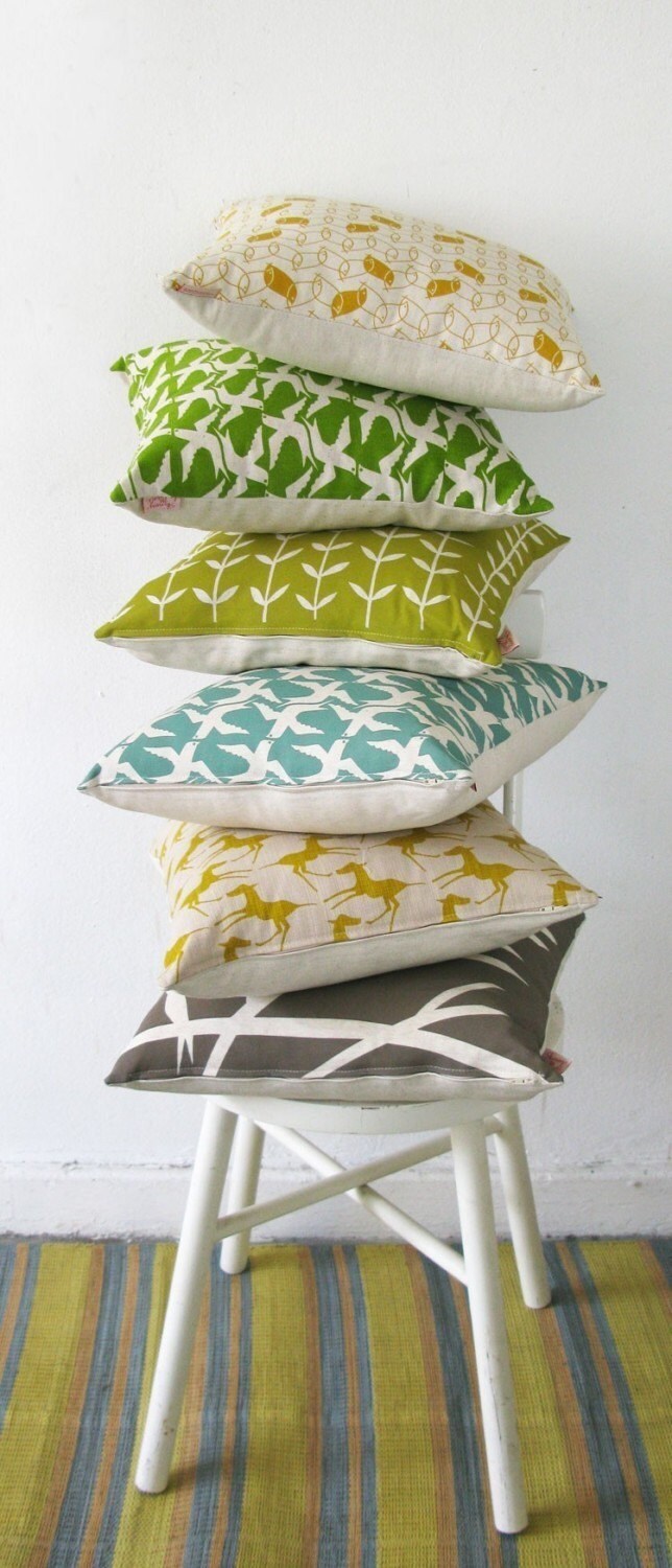

Friday, 10 February 2012
taking great photos: free button download
To my fabulous contributors for The Crafter's Guide to Taking Great Photos. You are welcome to download any of these free 250x250px buttons that I made for your website or blog. Find the US button here, the UK button here and the AU button here. Link your button through to your choice of Interweave, Amazon.com, Search Press, Amazon.co.uk or Murdoch Books.

taking great photos giveaway: from frankie and canadian living
Are you still feeling lucky? Two more giveaways of The Crafter's Guide to Taking Great Photos are rocking and rolling:
Frankie - click here for more details and your chance to win a copy

 Photos: Frankie (top) and Canadian Living (bottom)
Frankie - click here for more details and your chance to win a copy

And there are two days left to enter at Canadian Living - click here for more details and your chance to win a copy. Good luck!

Thursday, 2 February 2012
taking great photos giveaway: from jenny and jenny
Today might be your lucky day! Two of the gorgeous crafters interviewed in The Crafter's Guide to Taking Great Photos are each hosting a giveaway of the book:
Jenny Gordy from Wiksten - click here for more details and your chance to win a copy.
 And Jenny Nemlekar from Jenny N Design - click here for more details and your chance to win a copy.

Jenny Gordy from Wiksten - click here for more details and your chance to win a copy.

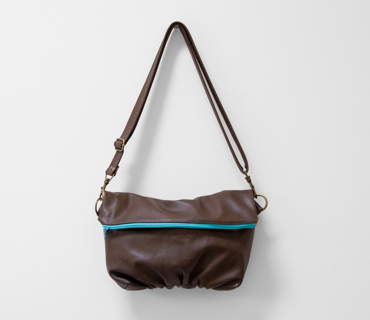
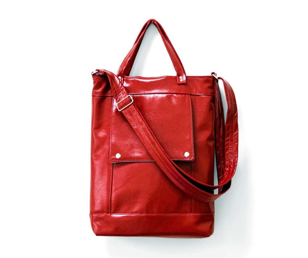
Photos: top Wiksten; bottom Jenny N Design
Tuesday, 24 January 2012
taking great photos: blog tour
My book and I are officially on tour. A blog tour! Yes, we've hit the e-road and Jenny's post on Crescendoh (and her review of the book) is the first stop for the US and Canada. Next up will be:


24 January - papernstitch
25 January - Mark Lipinski’s Creative Mojo Podcast
26 January - Rena Tom
27 January - CraftBuds
28 January - SweatShopofLove
31 January - Wiksten **giveaway**
1 February - Jenny N Design **giveaway**
2 February - Rifle Paper Co.
3 February - See How We Sew **giveaway**
4 February - Imagination Kids Toys
6 February - Canadian Living Craft Blog **giveaway**
UK:
7 February - Feeling Stitchy
Subscribe to:
Posts (Atom)